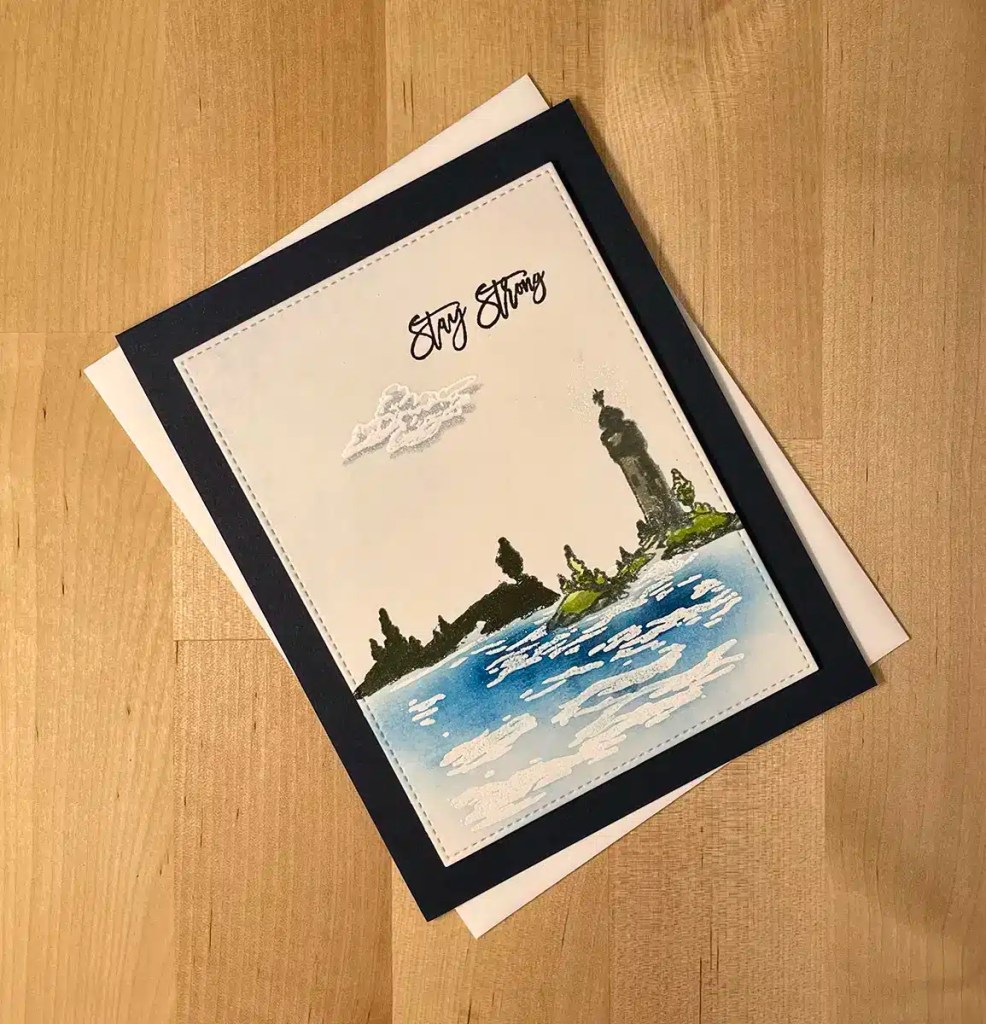
Learn how to create a mood for our cards using color.
Altenew’s cardmaking course In the Mood for Color teaches us to use color to set the tone for the card. When we do so we have to plan ahead to determine just what that tone should be.
An article posted by www.Supercolor.com on December 18, 2020, said that “The color blue represents both the sky and the sea and is associated with open spaces, freedom, intuition, imagination, inspiration, and sensitivity. Blue also represents meanings of depth, trust, loyalty, sincerity, wisdom, confidence, stability, faith, and intelligence.”
We’re going for the open spaces, confidence, and stability for our card.

Land Stamping
We’ll be using a stamp set from Altenew called Be A Lighthouse. And we’ll start by stamping the outline stamp of the lighthouse with the lightest color of gray onto a piece of white cardstock. We’re going to mask off what we’ve just stamped so we’ll stamp it again onto a piece of masking paper.
While that’s drying we’ll stamp the second layer onto the lighthouse using the darker gray. And then we’ll color in the land using alcohol markers. When we’re done and the ink on the making paper is dry we’ll take the backing paper off and adhere our masked lighthouse image over the stamped one.
Now we’re going to use the stamp that is meant to color the ground that we just colored in as a silhouette of land behind the lighthouse. We’ll offset it to the left and slightly higher than the image that we’ve just masked to give some depth to the scene that we’re creating.
Watermark Stamping
Next, with watermark ink, we’ll stamp the water after brushing a little anti-static powder over the card panel. We place the stamp right at the bottom edge of the silhouette that we just stamped and centered on the card panel.
We’ll also use the watermark ink to stamp the clouds up over the “island”. Then we’ll sprinkle white embossing powder over the card and tap it to remove any powder that isn’t attached to the ink. And then we use our heat gun moving it over the card until the powder is smooth and shiny.
Emboss Resist to Create the Mood For our Cards Using Color
Now, holding our small blending brush back towards the end of the handle we’re going to begin to add color to the water. By holding the brush this way we are able to keep the color very light. Then we can go over areas closer to the land to give the appearance of depth in the water. And we’ll use a piece of paper towel to lightly rub over where we’ve blended to pick up any ink that is sitting on the heat embossing.
It’s hard to see in the photo, but we also want to blend a little more blue for the sky.
We’ll also stamp the second layer of the clouds, but instead of stamping it inside of the outline, we’re going to put it slightly below to give the clouds some depth.
Now to finish off the card we just remove the masking and stamp the sentiment. And then we just add a piece of foam tape that is just slightly smaller than the card base and adhere it to the card panel.
Our Card’s Mood
We used water to represent wide open spaces. And lighthouses have given sailors confidence to navigate dangerous coastlines for safe entry to the harbor for thousands of years. So not only does the lighthouse represent confidence it also represents stability. What do you think?
Create the Mood Card Supplies
The following list may contain affiliate links. If you purchase something by following a link on this page, I may receive a small commission at no extra cost to you. Thank you for supporting my blog.
As an Amazon Associate I earn from qualifying purchases
- Cardstock: Taylored Expressions Blue Corn; Neenah Classic Crest 80lb Solar White
- Stamp: Altenew Be a Lighthouse
- Die: Gina K Designs Master Layouts 2
- Ink: Altenew Crips Inks – Starlight, Desert Night, Arctic, Industrial Diamond Evening Gray; Altenew Pigment Ink – Obsidian; Watermark Ink – Versamark
- Alcohal Markers: Altenew Frayed leaf, Forest Glades, Evergreen
- Adhesives: Scrapbook.com Double-sided Adhesive Foam Sheets
- Mini Blending Brush: Gina K Designs
For More Inspiration on Using Color to Create Moods for Your Cards
Check out DIY Card How To’s Using Stencils where we use blending and silhouettes to create a striking mood.


What a stunning card, Teri. It looks so serene.
Thank you for submitting your work to the AECP assignment gallery.